How to Use Choice Architecture to Simplify Your Statement Design
August 12, 2015 •Brian Watson

 The world is a hectic, complex place – and it does a good job of keeping us thinking.
In an average day, we make thousands of decisions. Some are big and require active thought, like when to ask for a promotion or how much of your paycheck to put into a 401(k). Others are much smaller and more intuitive, like determining if there’s hostility in a co-worker's voice or whether to use a fork or a spoon to eat mashed potatoes at lunch.
And while thousands of choices a day may seem like a lot of time spent in deliberation, our brains are incredibly efficient at quickly compartmentalizing decisions.
We use a two-pronged system that helps us mobilize mental resources to tackle each specific situation. To simplify how we engage information and make decisions, our brains more or less tell us when to think "fast" and when to think "slow".
Noble Prize winning psychologist Daniel Kahneman uses the terms System 1 and System 2 to describe how the process works.
System 1 operates quickly and automatically, with little effort or voluntary control – using mental shortcuts to make intuitive snap-judgments. These are the small “choices” you make without really thinking about them – when someone experienced with a manual decision decides to shift their car from first to second gear, or when you hear someone’s voice and immediately associate it with a specific friend or family member, for example.
Choices that require more mental energy burn calories and can even deplete decision making skills – a process called decision fatigue. System 2 is called on to resolve these kinds of complex, front-of-mind problems using a process that’s more rational and purposeful.
How can System 1 and 2 thinking be used to improve revenue collection?
The Link Between Choice Architecture and Billing and Payment
Choice architecture is concerned with building optimal default choices into situations where a decision must be made. The idea is help nudge people to the smartest course of action by simplifying the choice as much as possible.
Defaults work much the same way as System 1 mental shortcuts and heuristics. Whether people are pressed for time, or lack good information, or just plain don’t care, defaults can help drive quick, intuitive top-of-mind decisions that save time, energy, and unnecessary stress.
From a revenue collection standpoint, billers can use choice architecture to identify smart default decisions that save customers time and money and make it easier for them to quickly understand their statement.
Designing Statements for Default
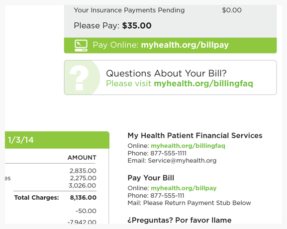
What do I owe? How do I pay? What’s the best way to have my question answered?
High-performing statements provide quick answers to those kinds of core billing questions – using intentional design techniques to reduce costly communication breakdowns and drive faster response.
Default design builds on those user-friendly principles by intentionally creating billing policies and visual cues that engage recipients’ System 1 thinking.
The default choice is extremely important – research shows that when people are given a default option, it is the one selected most often. Highlighting a single option helps billers guide customers to take the smartest, most direct course of action – one that helps them better understand their statement, pay a balance faster, or get a question answered with as little hassle as possible.
That isn’t to say that other non-default options should be removed. The goal of default design is to make it easy for customers to make the best choice, while still providing the opportunity to select a different possibility.
Take bill payment, for instance. The average U.S. household uses three different bill payment methods each month – and 42% will use a different payment channel than they did last month to pay the same bill based upon factors like size of the balance, proximity to the due date, or availability of funds. Rather than force all customers to pay online, default design heavily emphasizes e-payment while also enabling other pay channels, like phone, mail, text message, or in-person.
By defaulting to billing tools that are simple, efficient, and informative – instead of making customers explicitly request them – you’re putting your best financial communication foot forward.
Default to Summary Statement Design
In 2007, many iPhone early adopters were shocked to find that their first bill from AT&T arrived in a box instead of a window envelope. Every phone call, text message, and Internet access for the billing period was meticulously detailed in a line-item summary on the statement.
As you might expect, customers who were particularly active data plan users received truly massive bills. Several customers reported receiving 52-page statements printed front-and-back. Another was famously sent a boxed, 300-plus page statement – over half a ream of paper for one very long, very superfluous bill.
While that example is obviously atypical, it’s indicative of a larger billing issue. Many statements are simply too long – stuffed with more information than is really necessary.
Including additional information – like line-item charges or an account of monthly usage – might appeal to a small segment of detail-oriented customers, but it’s a nuisance for the rest of us. The point of your statements should be to help customers to quickly understand their statement at a glance.
Customers generally know what their cable package includes or what medical services they received. What they usually don’t know is what to pay. Operative details are what matters most: what’s been paid already and what’s leftover, the total amount owed, when it’s due and how to pay.
Default to a summary billing model – where line-item charges are totaled to provide a single balance due. For customers who want more details, provide the ability to request an itemized bill or access a full list of charges in an online billing and payment portal.
Emphasize Self-Service Channels
Nearly three-in-four bills are now paid using an electronic channel.
And there’s similarly broad support for online customer service tools. Ninety-one percent of consumers polled in a 2012 Amdocs survey claimed they would use a single online knowledge base if it were available and tailored to their needs.
Given their popularity with consumers and the clear benefits to billers, it makes sense to highlight self-service channels on billing correspondence – while still providing access to more traditional options.
Emphasize self-service channels with intuitive design tools like:
• Prominent, above-the-fold placement
• Graphics and call-out boxes
• Bold color and large font.

Emphasize self-service options while still providing customers with traditional channels.
Motivating Change to Improve Financial Communication
People tend to have an irrational preference for the way they currently do things. Even when offered a new option that could provide significant benefit, we generally stick to the default option and the path of least resistance.
Psychologists call this the Status Quo Bias – and there’s no shortage of real-life examples.
Researchers have found huge disparities in effective consent percentages between European countries that use a default opt-in policy of presumed consent for organ donation and those that require participants to opt-in manually, for example. Countries pursing an automatic opt-in policy averaged a 99.6% participation rate, while those that required explicit approval only averaged 12.1%.
Similarly, magazine subscriptions that auto-renew until the customer actively cancels the subscription outperform those where the recipient has to manually re-subscribe – causing many people to pay for magazines they no longer read.
Subtle-yet-purposeful billing nudges can help customers overcome their reluctance to break out of the status quo – and improve their overall billing experience. Paperless billing adoption is one area where choice architecture can help motivate dubious consumers to try a beneficial new technology.
Paperless Billing
A majority of bills are now paid using an online channel. In 2014, over 70% of all U.S. bill payments were handled electronically.
And while paperless billing is growing – up 2% from 2013 to 2014 – its progress is a whole lot more deliberate. Just 23% of bills distributed in 2014 were delivered electronically – despite offering consumers less clutter, convenient alerts, and easy, secure digital record keeping.
Not surprisingly, familiarity with the status quo is a reason commonly cited by consumers resisting the switch to paperless billing. In a recent survey, 42% cited comfort with the current system as one of the reasons why they hadn’t yet moved from paper- to e-statements.
However, once consumers actually try an e-statement service, they’re far more likely to remain paperless users. One review of banks that allowed customers to try paperless billing before they turned off paper statements altogether reported a roughly 300% increase in adoption.
To nudge customers down that path, consider:
Incentivizing Paperless Billing
There are many ways for businesses to incent customers to try paperless billing, including sweepstakes, discounts, and gift cards or cash rewards.
Whatever the motivating factor, the idea is to boost adoption by flipping what is considered the status quo. Once customers become paperless billing users, they’re far less likely to switch back to paper statements – especially when they can experience the benefits first-hand.
Using a Trial Period
Some customers are wary to even try e-statements if it means giving up paper delivery. So consider a trial period where they receive both to help ease the transition.
At the end of the intro term, all customers who don’t explicitly opt back into paper statement delivery are automatically enrolled as paperless-only users. Once again, the goal is to change consumers’ habits by reversing the way things are currently done.
Tying Auto Opt-In to Popular Online Tools
Emerging tools payment alerts and reminders are key drivers of paperless billing adoption. Consider that two thirds of consumers want bill payment alerts and 71% would switch to paperless billing if they also received reminders.
Leverage that sentiment to increase e-statement adoption by automatically opting-in users who register for alert tools – by adding a defaulted paperless billing check-box enrollment to the sign up process, for example.
Not surprisingly, many business worry that such a policy could have unintended consequences, such as reducing online payment or affecting customer satisfaction scores. To help lessen those concerns, pair an auto opt-in with transparent, easy-to-use un-enrollment tools and the trial paperless billing period described above.
Get Updates
Featured Articles
Categories
- Charity Care Management (1)
- Compliance (2)
- Customer Service (8)
- Digital Front Door (1)
- Direct Mail (6)
- eBilling (1)
- EBPP (34)
- ESL Statement (2)
- eStatement (1)
- Healthcare Channel Partner Billing (1)
- IVR (3)
- Mobile Payment (11)
- Online Billing and Payment (6)
- Online Patient Payment (17)
- Outsource Print Management (4)
- Paperless Billing (4)
- Patient Engagement (2)
- Patient Friendly Billing (21)
- Print and Mail (7)
- QR Codes (1)
- Quick Pay (7)
- Security (1)
- Self-Pay Patients (9)
- Self-Pay Revenue (4)
- Statement Design (32)
- Statement Print and Mail (1)
- Statement Printing and Mailing (28)
- Statement Processing (36)
- TransPromo (1)
- Up-Front Billing (1)


