October 29, 2012 •Brian Watson

 If you build it, they will come. That may fly if you’re turning an Iowa cornfield into a veritable field of dreams, but it doesn’t cut it when it comes to encouraging patient use of EBPP.
The truth is that things like page placement and enrollment simplicity are crucial for patient EBPP acceptance. That’s because - despite the benefits to both patients and providers - online billing and payment is still pretty much confined to early-adopters. The proof: only about 9% of the sum total of all patient payments came from online sources, according to a 2010 InstaMed survey.
To jar patients out of their traditional paper billing and check or phone payment routine, you need to make it simple (as in completely, totally, fall-off-a-log–easy) for patients to find and use your e-Statement website.
Forcing patients to hunt around your page to find a link to the application? That’s not simple. Neither is putting patient through several clicks to reach their final destination. Or an extra-long enrollment process. Some patients will put up with those issues, but others will just pick up the phone and give you a call to make a payment. Or mail you funds. Or (worse yet) give up on the process and just browse Pintrest instead.
The point: website branding is certainly important. The look and design of your web page helps describe your brand to patients in a glance. But it shouldn’t come at the expense of preventing patients that want to pay immediately from, well, paying immediately.
In this blog, we’ll highlight the kinds of things you might be doing – inadvertently of course – that could be costing you patient enrollments. And then look to real-life examples of EBPP solutions that are doing those things right (and how they're doing it).
No-no Number 1: You Buried the Link.
The first obstacle to EBPP acceptance might also be the one you have the least direct control over: patients just can’t find your eStatement application. Whether you web designers have buried it under a foundation of clicks, swept it down the page way below the fold, or don’t adequately call attention to it, patients shouldn’t have to hunt and search to pay their bill online.
That’s counterproductive – both from a web usability and eStatement enrollment standpoint. It increases your bounce rate and can even harm patient satisfaction. Instead, use top-of-page placement and plenty of repetition to ensure that your billing platform easily stands out to interested site visitors.
A Best-Practice Example

What should you be doing to capture new online payment users from the first click? Baptist Memorial Healthcare in Memphis, Tennessee (full disclosure: Baptist is a customer of Elite), does a really solid job of featuring their online bill payment app prominently on their website. What are they doing right?
1). Owning the Top of the fold. Baptist is most assuredly not burying the lead. EBPP links are above the fold on the homepage, meaning that patients don’t need to scroll or hunt to find the bill payment link they’re after.
2). Repetition, Repetition. On the homepage alone, Baptist provides four links to their eStatement website. (Three of which are above the fold, no less). This provides ample opportunity for patients to find the application without excessive scanning.
3). Get Graphical. Graphics add emphasis and communicate key concepts at a glance. Baptist uses graphics effectively on their homepage to provide a visual cue for patients seeking out specific health and account management tools.
No-no Number 2: No Payment Without Enrollment
Healthcare billing is more complex than other industries that use the mailstream to collect customer revenue. As a hospital, your patient base changes dramatically from billing cycle to cycle. Those “one-time” patients might not see the benefit in full bill presentment. But getting them to pay online still can benefit your bottom line from a speed/cost containment standpoint.
That’s why best-practice EBPP solutions incorporate both full bill presentment and payment and a quick pay without enrollment option. Because without that quick-pay alternate, many patients might choose to opt-out from online payment entirely.
A Best-Practice Example

UC Health in Cincinnati eschews full presentment for a quick-pay portal only approach. Although that could cause them to miss out on patient-satisfaction-boosting tools like payment plan enrollment, payment/statement viewing and history, and trackable online support, they’ve compensated by doing a great job of touting the benefits of online payment. The approach works because:
1). It Focuses on Security. Large, impactful graphics call attention to the site’s security bona-fides, including providing a link to their HIPAA policy for patient peace-of-mind.
2). It Auto-Populates. Asking patients for their guarantor and account numbers enables the application to automatically populate the patient’s account information, so that all they need to add is credit/debit or bank account information for payment. That makes the process easier and faster.
No-no Number 3: The Application Homepage Is Generic
So the patient has reached your payment site? Congrats! That’s a major win on the path to patient acceptance. But it’s not a full-fledged victory just yet. A generic, bare-bones platform landing page can also scare patients off the enrollment process.
You need this page to look the part from a branding perspective. Sell the service to your patients. And help answer any last-minute, pre-signup questions that they might still have.
A Best-Practice Example
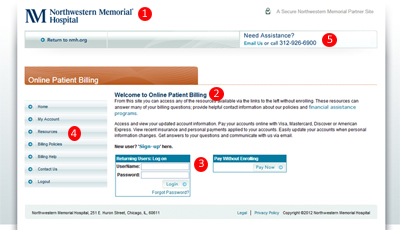
Northwestern Memorial Hospital in Chicago has an application that absolutely nails the portal homepage. Here’s why:
1). A Familiar Face. Branding is always important. But especially so when it means establishing trust with potentially skeptical customers. And – despite the wide adoption of eCommerce – online billing and payment is definitely virgin territory for many patients. Northwestern Mutual uses brand indicators (like their logo, links back to the homepage, and contact information) to ensure patients have no problem trusting their website to make a payment.
2). Sell the Service. Just because a patient has made it to your EBPP homepage doesn’t mean they’re all-in as a user just yet. Faced with a potential daunting registration process, the bounce-probability is still relatively high. Northwest Mutual’s site recognizes this, featuring compelling feature/benefit statements designed to sell patients that are still a little bit skittish.
3). It Makes Payment Options Clear. As mentioned earlier, it’s important for healthcare providers to give patients plenty of online payment options. And to let them know exactly what they should expect to receive from each alternative. Northwestern Memorial gives patients the option of either full presentment and payment or quick-pay without enrollment. Then helps make the decision process as easy as possible for patients: separating both options with clear call-out boxes and quick-but-informative descriptions.
4). Anticipates Questions. Northwestern Memorial’s site is well positioned to answer any last-minute questions patients might have that could disrupt enrollment. It features links to billing resources and information (including a FAQs and the hospital’s privacy and charity care policies) that help answer patient questions and keep them on the site - rather than on the phone contacting your service staff.
5). It’s Transparent. Partner sites often don’t have the same URL as your main homepage. Some patients will understand that’s normal and proceed accordingly. Others might be less confident. By putting the small disclaimer “A Secure Northwestern Memorial Partner Site” in the header, the hospital is doing a lot to put its consumers’ minds at ease.
No-no Number 4: A Long, Drawn-Out Enrollment Process
The last objection to overcome? An overly-long enrollment process. If your solution is putting too much on patients’ plates too soon, you’ll likely pay for it with more enrollment bounces. Stuff like payment source verification or insurance setup can wait. The most important thing at this point in the process is adding patients to the application. In other words: keep it simple.
A Best-Practice Example
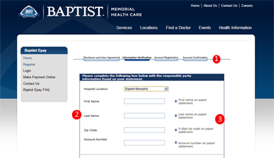
Going back to Baptist Memorial Healthcare (full disclosure: still a client of ours), their enrollment process is best-practice because it’s easy and informative, leveraging traits like:
1). It’s Bite-Sized. Due to HIPAA and PCI compliancy regulations, you’re going to need – at minimum – account information and an eVerification from patients. So follow Baptist’s lead: break information down into manageable chunks and give patients a way to check on their status during the process. It prevents long, daunting single-page forms and let’s patients know that they’re really close to the finish line.
2). It Doesn’t Ask for Unnecessary Info. Patients will only put up with so much inconvenience during sign-up. So save important-but-not vital elements like establishing payment sources for after patients are already enrolled.
3). Clear Titles, Full Instructions, Can’t Lose. Keeping with the simplicity mantra, form fields should feature clear titles, and brief, impactful instructions that let patients know exactly what they should be putting in each blank (and where to find that information). Other smart tips? Enable auto-filling of information from previously completed forms. And plan for the inevitability of form error. Highlight faulty fields highlighted (red works best) and provide an explanation as to exactly what’s wrong - not just that there is a problem.
Online billing and payment is good for your bottom line. It’s fast. It’s efficient. And patients really love it. But mastering the intricacies of best-practice EBPP can be tough. If you’re looking for a little guidance, we invite you to download our free whitepaper The New Rules of Patient EBPP.
How did you score on our eStatement no-no list?