February 4, 2013 •Brian Watson
 Smartphones are seemingly everywhere these days. Whether it’s around the office or in your favorite coffee shop, you probably don’t have to look very far to find someone tapping, dragging, and pinching away on their touch-screen.
In this case, perception isn’t far from reality. The Pew Internet Project’s most recent report (published in December 2012) found that 45% of American adults now own a smartphone. And that number grows with each new iPhone, Android, or Blackberry release.
What’s more, according to a 2012 Google Study, 81% of U.S. smartphone users access the web from their phone.
For billers, that should sound like the sweet sound of opportunity knocking. The growth of the mobile web provides a great opportunity to accelerate customer payment, reduce collection costs and automate billing practices.
But mobile payment isn’t without challenges.
Smartphone-savvy customers likely have considerable experience with apps or websites designed specifically for the medium. So simply presenting a mobile version of your desktop EBPP portal isn’t likely to result in a web experience that’s particularly user-friendly. Especially given that online billing and payment uses elements like forms, fields and buttons that can be really frustrating to use on a poorly-developed mobile site.
Making mobile pay an afterthought can negatively affect a host of bottom line-critical stuff: from customer billing and payment satisfaction, to EBPP acceptance and use, to the way that people perceive your brand in the marketplace.
So put it squarely on the front burner by emphasizing simple, clean, user-friendly mobile EBPP design strategies - just like those described in this post.
Even the best-designed websites miss the mark if customers can’t view them properly. As anyone that’s ever zoomed and zoomed to get a web button to “clickable” size can attest, browsing desktop-specific websites on a mobile device can be a frustrating, time-consuming experience.
Mobile billing and payment websites are no different. In fact, they might be more sensitive to unresponsive design. The goal of your users is pretty well defined: customers want to use their phone or tablet to view a billing summary and make a payment. No need for a ton of content or bells and whistles.
Applications that cram a full website onto a mobile device’s small screen run the risk of alienating customers that pay online, forcing them to scroll or zoom too much or use hard-to-manage forms, buttons and pull down menus.
So be mindful of the medium by providing customers with an EBPP website that:
• Is designed specifically for mobile users.
• Uses automatic mobile detection to identify smartphone or tablet users and redirect their browsers to the mobile-friendly version of your site.
• Understands the bandwidth constraints and uneven connection speeds of the average mobile web user, keeping load times manageable by limiting design elements.
• Responds to screen-size limitations by featuring a large, clear, readable font type.
• Uses large, simple, mobile-optimized forms for everything from login through payment.
• Makes buttons large, finger-friendly and easily clickable.
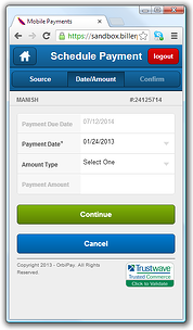
Keep your mobile pay website design clean, clear and finger-friendly - like the example above.
While 81% of U.S. smartphone users may access the web from their phone, only 12% have used it to make a mobile payment (according to a 2012 report from the U.S. Board of Governors of the Federal Reserve).
Some of that disparity can be explained as consumers adjusting slowly to a new billing channel. But it also speaks to the nervousness many consumers have about the technology.
It’s one thing to pay a bill from a home PC with a secure, password-protected wireless connection. But paying with a mobile device provides a whole new set of concerns: phones are portable (and easier to lose or have stolen) and mobile pay websites often just look different than their desktop counterparts, setting off all sorts of alarms about website security.
The truth is that smartphone billing and payment websites are every bit as secure and encrypted as traditional EBPP options. But that truth means little if customers don’t feel absolutely comfortable using your app to manage their account. Give your mobile pay users peace-of-mind by:
• Requiring log-in, password confirmation and device authorization for all users.
• Highlighting your logo on the portal login page and keeping the general look and feel of your website (e.g. colors, branding and navigation elements) consistent among the mobile and desktop versions of your EBPP website.
• Displaying your security standards prominently throughout the site – especially on the portal login page.
The most effective mobile billing and payment websites are designed specifically to meet narrowly-defined customer objectives. Think of it this way: your smartphone users are also your online billing and payment users. The only difference is the way they access your site.
For example, a customer might use your full EBPP portal to send a message to your service staff, setup a payment plan or download a financial assistance. Then respond to a text or IVR billing notification sent to their phone by making a payment at your mobile pay site.
In other words, designing to the strengths (and weaknesses) of the medium is really important.
Mobile EBPP is constrained by a much smaller screen, bandwidth issues and wireless signal concerns. So adding option after option that isn’t tied directly tied to payment doesn’t make a ton of sense.
That’s why best-practice mobile EBPP websites tend to embrace a simple, intuitive, less-is-more payment experience that:
• Mimics the design of popular apps by keeping navigation really simple. On-screen menus should be at most 3 or 4 buttons and feature call-out buttons for common actions, like "home", "back" or "logout". And all page titles and navigation should fit cleanly within the dimensions of the screen at the same time. Don’t assume that users will intuitively know to zoom or scroll – many won’t.
• Adds tools sparingly. Think about how much a feature will improve the online experience versus how much it will take away from it.
• Focuses on payment. Ensure that key payment details (like balance, amount due and payment due date) are easy to find and that payment links and buttons are clear and impactful.
•Includes a deep assortment of payment options, like the ability for customers to add or adjust funding sources and select the payment type (e.g. one-time, payment plan or pre-authorized payment).
Is mobile a part of your EBPP toolset? Tell us why (or why not) in the comments section.